Graphs play a crucial role in our everyday lives, often going unnoticed as powerful tools that convey information in a visual and accessible manner. Whether in business, education, or personal decision-making, graphs help us make sense of complex data and tell compelling stories. In this blog, we'll explore the pervasive presence of graphs in various aspects of our daily lives and how they contribute to a better understanding of the world around us.
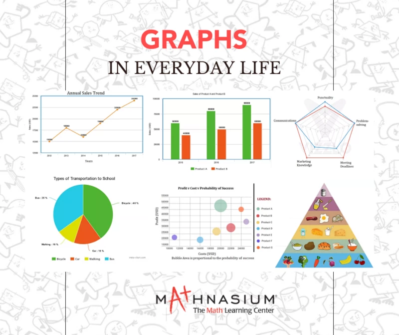
One of the most common types of graphs is the bar graph, and it is frequently used to represent categorical data. For instance, think about the nutrition labels on food products. The bar graph on these labels provides a quick and easy way to compare the amounts of different nutrients, helping consumers make informed choices about their dietary intake. Similarly, bar graphs are employed in business reports and presentations to illustrate sales figures, market trends, and other important metrics.
Line graphs, on the other hand, are excellent for displaying trends over time. When you check the weather forecast, you're likely to encounter line graphs depicting temperature fluctuations throughout the day or week. These visual representations make it easy for us to anticipate changes and plan accordingly. In financial news, line graphs often depict the performance of stocks, showing investors how a particular asset has fared over time. This helps individuals make informed decisions about their investments based on historical patterns.
Pie charts are another popular form of data visualization, commonly found in reports, presentations, and even household budgeting. Consider a pie chart illustrating monthly expenses – it provides a clear breakdown of where the money is going, helping individuals manage their finances more effectively. In business meetings, pie charts are frequently used to showcase market share distribution, making it easy for stakeholders to grasp the competitive landscape at a glance.
Network graphs, though less common in everyday contexts, are gaining significance with the rise of social media. Platforms like Facebook and LinkedIn utilize network graphs to display connections between users. These visual representations not only help users understand their social networks but also enable companies to analyze user interactions and preferences, informing targeted advertising and content recommendations.
In education, graphs are indispensable tools for conveying complex concepts. We often use visual aids, such as bar graphs or pie charts, to make mathematical and scientific principles more accessible to students. When studying scientific phenomena or historical trends, students frequently create graphs to analyze and interpret data, enhancing their critical thinking and analytical skills.
Graphs are everywhere when you look for them and they are integral to our daily lives, providing a visual language for understanding and interpreting data. From business reports to weather forecasts, from personal finance to social networks, graphs play a pivotal role in communicating information efficiently and compellingly. As we navigate our data-driven world, being graph-literate is increasingly important, empowering us to make informed decisions and appreciate the stories that data has to tell. So, the next time you encounter a graph, take a moment to appreciate the story it conveys and the insights it unlocks.


 (305) 396-3202