











In statistics, the distribution of data along a bell-shaped curve that reaches its maximum height at the mean.
A normal curve is a way of showing how data is spread out. When we graph certain kinds of data, the result is a smooth, symmetrical shape that looks like a bell: wide in the middle and tapering off on both sides. That shape is the normal curve.
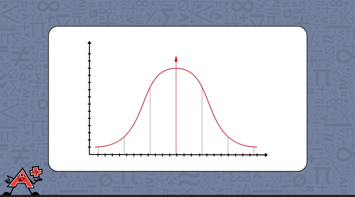
The middle of the curve, where it is tallest, sits at the mean. This is where most of the data points cluster. As values move further from the mean in either direction, they become less and less common, which is why the curve gets lower toward the edges.
A classic example is height. If we measured the heights of a large group of people and plotted them, most would land near the average, with fewer people at the very short or very tall ends. The resulting graph would look like a bell.
The normal curve is also called a bell curve or normal distribution. It appears across many real-world contexts, from test scores to natural measurements, and is one of the most important shapes in statistics.
When Do Students Learn About the Normal Curve?
Students build toward understanding the normal curve by first learning about data, averages, and distributions.
Grades 6–8 – Data, Averages, and Distributions
Students learn to calculate and interpret the mean, and begin exploring how data spreads around a center value. This lays the groundwork for understanding the normal curve.
Grades 9+ – Formal Introduction to the Normal Curve
Students encounter the normal curve in statistics, learning how to interpret its shape, use the mean and standard deviation, and apply it to real-world data sets.