Students begin working with box plots, a type of data display, in middle school. Box plots also appear in data-analysis questions on state assessments. For example, in our home state of Texas, box plots are included in the Grade 6 STAAR math-assessed curriculum.
We can see box plots outside the classroom, too. They are especially helpful when a data set is too large to understand easily by listing every value, such as when we compare prices, look at sports statistics, or track weather patterns.
Today, Mathnasium tutors will break down what a box plot is, what each part means, and how to read one.

What Is a Box Plot in Math?
A box plot, also called a box-and-whisker plot, is a visual chart showing how a set of data is spread out. Instead of plotting every single value, it uses a box and two lines called whiskers to summarize the whole data set.
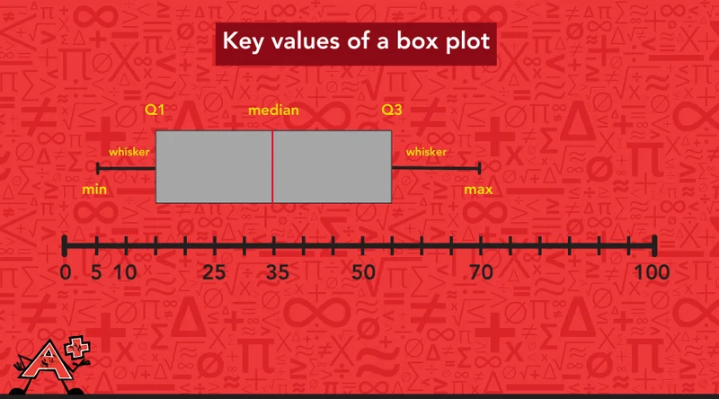
A box plot is built from five key values. The easiest way to understand them is to walk through the plot from left to right, the same way we'd read it.
-
Minimum (min): the smallest value in the data set, marking where the plot starts.
-
Q1 (first quartile): the value marking the end of the first quarter of the data.
-
Median (Q2): the value marking the middle of the data, shown with a line inside the box.
-
Q3 (third quartile): the value marking the end of the third quarter of the data.
-
Maximum (max): the largest value in the data set, marking where the plot ends. We don't usually call this "Q4," but it does mark the end of the fourth and final quarter of the data.
Together, these five values divide the data into four sections, each holding about a quarter of the values. When we know where all five sit, two more pieces of the box plot start to make sense.
The whiskers are the lines connecting the box to the minimum and maximum. They show us the full range that the data covers, from the smallest value to the largest.
The box stretches from Q1 to Q3, showing us the middle half of the data at a glance.
Let's see how a box plot works through an example. Picture a family gathering with relatives of all different ages: 5, 9, 15, 22, 28, 35, 41, 48, 55, 63, and 70 years old.
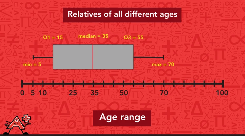
Instead of listing every single age, we can use a box plot to summarize that entire spread with just five numbers:
-
the youngest person there: min = 5 years,
-
the oldest person there: max = 70 years,
-
the middle age of the whole group: median = 35 years,
-
the two values splitting the younger and older halves into even quarters: Q1 = 15 years, Q3 = 55 years.
One glance at the plot, and we already know roughly how the ages are spread out, without reading a single name off a list.
📕 You May Also Like: How to Calculate the Median: A Beginner-Friendly Guide
How to Read a Box Plot
To read a box plot, we look at where each of its five key points falls on the number line beside it, then use those points together to understand how the data is spread out and spot unusual values and patterns.
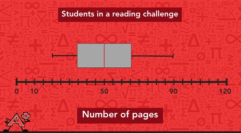
We’ll read a box plot step by step using one example, just as we would in a Mathnasium session: the number of pages a group of students read during a reading challenge.
Step 1: Identify the 5 Summary Points on the Box Plot
We find the whiskers to identify the minimum and maximum number of pages:
-
min = 20 pages
-
max = 90 pages
Then, we look at the edges of the box to identify the first quartile (Q1) and the third quartile (Q3):
-
Q1 = 35 pages
-
Q3 = 65 pages
After that, we find the line inside the box to identify the median:
Step 2: Measure the Spread of Data
The physical width of the chart sections tells us how tightly packed or spread out our data is. To measure the spread of the data, we need to find the interquartile range, the full range of the data, and the section length.
A. Interquartile Range
The interquartile range shows us how spread out the middle half of the data is. On a box plot, it is represented by the width of the box, from the first quartile (Q1) to the third quartile (Q3). We calculate the interquartile range by subtracting: Q3 – Q1 = 65 – 35 = 30 pages.
B. Full Range
The full range is the total spread of the data, from the minimum value to the maximum value. To find it, we subtract the minimum from the maximum: 90 – 20 = 70 pages.
C. Section Length
Section length shows how closely the data is grouped.
In our example, the shorter section lies between 35 and 65, which means most students read a similar number of pages. The longer section goes from 65 to 90, so if a student is one of the top readers, their page counts can vary a lot more.
Step 3: Find Unusual Values and Patterns
Box plots make it easy to spot patterns that a list of numbers alone might hide, like values that don't fit or data that leans one way more than the other. To describe these unusual values and patterns, we can use special math terms.
Outlier
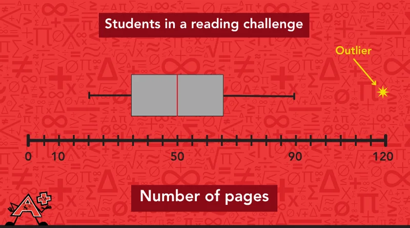
Outliers are values that are much lower or much higher than most of the data. On a box plot, they may appear as separate dots or stars beyond the whiskers.
Say most students in the reading challenge read between 20 and 90 pages, but one student reads 120 pages. That page count would show up as a separate dot, well outside the whiskers, letting us spot it at a glance instead of digging through a list of every student's total.
Symmetry
Symmetry means the data is balanced. We can tell if data is evenly balanced by looking at where the median line falls inside the box. When that line sits right in the middle, the values above and below it are spread out about the same amount, so the data is symmetric.
In our reading challenge example, the median (50) sits exactly halfway between Q1 (35) and Q3 (65), so the middle half of the data is symmetric.
Skewness
Skewness means the data is pulled more in one direction.
-
When the right whisker is significantly longer, the data is right-skewed, with more room to stretch out on the right.
-
When the left whisker is significantly longer, we call the data left-skewed, since the tail has more room to stretch out on the left.
Our reading challenge data doesn't skew either way since the median splits the box evenly, but if fewer students had read close to the minimum, the median would shift toward Q3 and the data would be left-skewed instead.
📕 You May Also Like: What Is an Outlier in Math? Explained For Middle School
Let's Try a Test-Style Box Plot Question
Box plot questions on assessments often ask us to pull out a specific piece of information or compare two parts of the plot. Now, we’ll walk through a question written the way it might show up on a test.
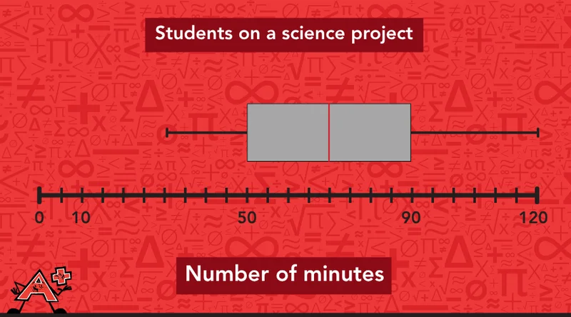
A box plot shows the number of minutes a group of students spent on a science project, with a minimum of 30, a first quartile of 50, a median of 70, a third quartile of 90, and a maximum of 120.
The question asks: What is the interquartile range, and what percentage of students spent more than the median amount of time?
1. Identify the Five Summary Points on the Plot
By looking at the box plot, we can read the five-number summary right away:
-
min = 30
-
Q1 = 50
-
median = 70
-
Q3 = 90
-
max = 120
2. Find the Interquartile Range
We subtract the first quartile from the third quartile to find the range of the middle 50% of the data:
90 − 50 = 40
The interquartile range is 40 minutes.
3. Answer the Percentage Question
The median always splits the data exactly in half, so we already know that 50% of students spent more than the median amount of time, regardless of the specific numbers involved.
In this case, that means half the students spent more than 70 minutes on their project.
📕 You May Also Like: 5 Ways to Use Diagrams and Drawings for Math Problems
Try Reading a Box Plot Yourself
Now it's your turn to put these steps to work. You can check your answer at the bottom of the page.
Problem:
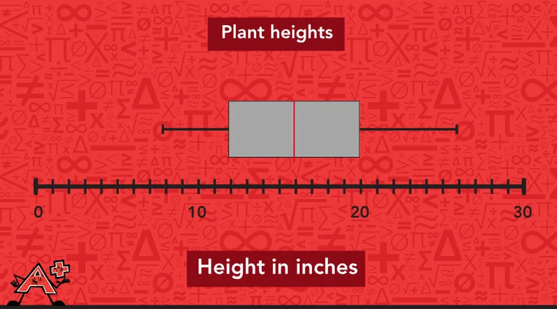
A box plot shows the heights of plants in a garden, measured in inches. Identify the median, the range, and the interquartile range.

At Mathnasium, we show students how to spot patterns, compare data, and explain their mathematical thinking.
How Mathnasium Helps Students Master Their Analytical Skills (and Beyond)
As a math-only learning center, Mathnasium helps K–12 students of all skill levels excel in math.
In our work with students, we focus on helping them understand the thinking behind each math concept and skill, including data literacy tools like box plots. Skills like reading quartiles and medians work best when students can connect them back to the number sense they already have.
Behind every program we offer is our proprietary teaching approach, the Mathnasium Method™. We don't just rely on rote drills but rather aim to help students truly understand what they're learning.
Each student begins their Mathnasium journey with a diagnostic assessment that helps us understand what they know, how they think, and where they are ready to grow next. From there, we create a personalized learning plan tailored to their needs.
Using these insights, we create a personalized learning plan focused on the skills a student needs most, whether that means building data analysis skills or preparing for an upcoming state assessment.
Our specially trained tutors explain math in clear, everyday language, using visual, verbal, tactile, and written techniques to help students make sense of math in a clear and engaging way. Students learn to spot patterns and connect math to the world around them, building understanding that goes beyond memorized steps.
The result? True, measurable progress:
-
94% of parents report improvement in their child's math skills and understanding
-
93% of parents report a more positive attitude toward math after attending Mathnasium
-
90% of students saw improvement in their school grades
Mathnasium operates over 1,100 learning centers across the U.S., bringing our proven approach close to your community.
For families in Mansfield, TX, and the surrounding communities, Mathnasium of Mansfield North is a trusted local center with years of experience transforming how students think and feel about math.
If data analysis, test prep, or any part of your child's math foundation feels shaky, a free diagnostic assessment is the right place to start. From there, we create a personalized learning plan around your child's needs, helping them master the right skills with support that adapts as they learn.
Ready to get started?
📅 Schedule a Free Assessment at Mathnasium of Mansfield North
Not near Mansfield North?
📍 Find a Mathnasium Learning Center Near You
Pssst! Check Your Answers Here
If you’ve given our box plot challenge a try, check how you did here:
-
Median: The line inside the box tells us the median directly: 16 inches.
-
Full range: We subtract the minimum from the maximum: 26 − 8 = 18 inches.
-
Interquartile range: We subtract the first quartile from the third quartile: 20 − 12 = 8 inches.


 (833) 579-6284