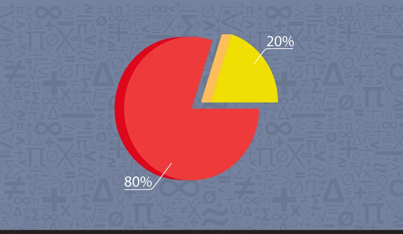
When students struggle to make sense of numbers, turning to visual tools often helps clear up confusion. At Mathnasium, we regularly use models like number lines, ten-frames, and fraction bars to help kids see how numbers relate to one another.
Circle graphs, also known as pie charts, are another great visual tool for showing data.
In this guide, we'll explain what circle graphs are, how to read and create them step by step, and when to choose them over a bar graph to clearly represent your data.

What Is a Circle Graph?
A circle graph, also called a pie chart, is a round graph that shows how a whole amount is divided into smaller slices, with each slice sized to match its share of the total.
The entire circle always adds up to 100%, so every slice shows its exact share of the whole amount.
The bigger the slice, the bigger the percent it represents.
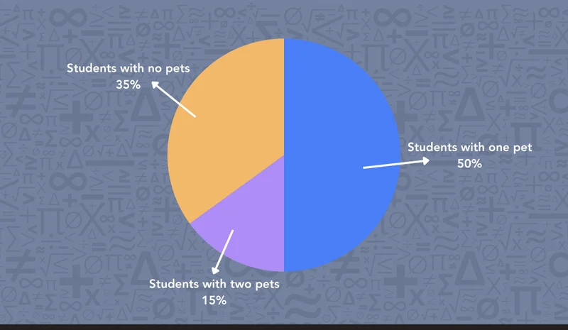
Here’s an easy example. In a class of 20 students, 10 have one pet, 7 have no pets, and 3 have two pets. With the whole class equaling 20 students (100%), each group represents a portion of that total:
-
10 out of 20 students (50%) have one pet
-
7 out of 20 students (35%) have no pets
-
3 out of 20 students (15%) have two pets
Here is how that data looks visually in a circle graph:
Even though our pie chart shows every slice as a percentage, that is only one way to display the data.
If we look at just one part of our example, the 50% of students (10 out of 20) who have one pet, we could write that same share in two other ways:
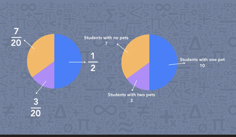
No matter how we label the slice, its size stays the same.
Circle graphs help us:
-
See the entire total at once: See the full set of data together without getting lost in a table of numbers.
-
Understand parts of a whole: Visually connect how fractions, percents, and counts make up a complete total (100%).
-
Compare categories quickly: Spot which option is the most popular, least popular, or equal just by comparing slice sizes.
So, those are the basics! If you have these down, you are ready for the next step—learning how to read one.

How to Read a Pie Chart
At Mathnasium, we love to show how math works through examples. To see how to read a pie chart efficiently, let's start with a survey of 50 students on their favorite season:
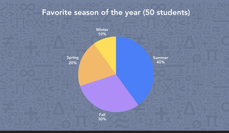
To make sense of any pie chart, we can split the reading process into four simple steps:
1. Read the title
We start by checking the title to understand what data the graph is showing. In our case, this tells us we’re looking at "favorite season of the year" among 50 students.
2. Find the total sample size
We look for the overall number of participants to see what the entire circle represents. Here, the title notes a total of 50 students, meaning the whole chart (100%) equals 50.
3. Read the slice labels and percentages
Scan each section to match the categories with their visual proportions. Our chart shows:
-
Summer: 40%
-
Fall: 30%
-
Spring: 20%
-
Winter: 10%
4. Calculate the exact counts
Convert each percentage into the actual number of students by applying it to the total:
-
Summer: 40% of 50 = 20 students
-
Fall: 30% of 50 = 15 students
-
Spring: 20% of 50 = 10 students
-
Winter: 10% of 50 = 5 students
Bonus Step: Look for interesting takeaways
While this may not be an essential step, we can take a quick second to look beyond the basic numbers, which helps us see the bigger story the chart is telling us:
-
Find the top and bottom: We can see that Summer is the clear winner with almost half the votes (40%), while Winter got the fewest (10%).
-
Combine slices: When we combine Summer and Fall, we notice they make up 70% of the graph, showing us that most students in our group prefer the warmer months!
📕 You May Also Like: How to Teach Math to Visual Learners with Pictures & Manipulatives
How to Make a Circle Graph
Now, to build a pie chart, we first need some data to work with.
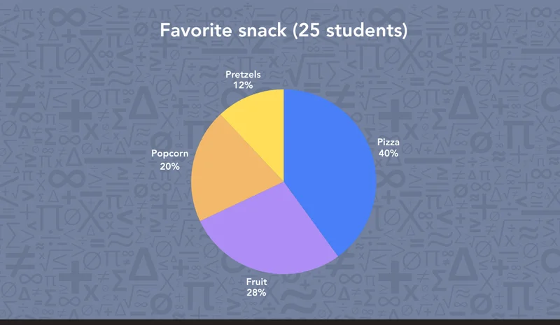
Imagine we asked 25 students about their favorite after-school snack. Here is what they might pick:
-
Pizza: 10 students
-
Fruit: 7 students
-
Popcorn: 5 students
-
Pretzels: 3 students
Since a complete circle measures 360 degrees (360°), each slice needs to take up its correct share of the circle. Here is how we turn our data into a chart in four steps:
1. Find the percentage for each group
Divide each category count by the total (25) and multiply by 100.
-
Pizza: 10 out of 25 = 40%
-
Fruit: 7 out of 25 = 28%
-
Popcorn: 5 out of 25 = 20%
-
Pretzels: 3 out of 25 = 12%
2. Calculate the angle for each slice
Since the entire circle is 360°, multiply each percentage (as a decimal) by 360° to find the slice's exact angle:
-
Pizza (40%): 0.4 × 360° = 144°
-
Fruit (28%): 0.28 × 360° = 100.8° (we can round up to 101°).
-
Popcorn (20%): 0.20 × 360° = 72°
-
Pretzels (12%): 0.12 × 360° = 43.2° (we can round down to 43°).
3. Check your total
We add all the angles together (144° + 101° + 72° + 43° = 360°). If they total 360°, we know our math is correct!
4. Draw and label your pie chart
Start with a simple circle and mark the center point. Use a ruler to draw a straight line from the center to the top edge, then use a protractor to measure out each angle step-by-step. Color each slice and add your title, labels, and percentages!
Circle Graph vs. Bar Graph: Which One Should We Use?
When we want to show data, pie charts (circle graphs) aren't always the right tool for the job. In many everyday scenarios, a bar graph is simply a better choice!
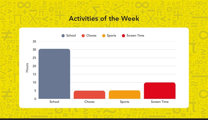
In case you forgot, a bar graph uses rectangular bars of different heights or lengths to show and compare amounts, like so:
So, how do we know which graph fits our data best? We broke it down in a quick reference table below:
|
|
Circle Graph
|
Bar Graph
|
|
Best for
|
Showing how parts make up a whole
|
Comparing amounts across categories
|
|
Reads as
|
Percent of the total
|
Exact values or counts
|
|
Easiest to spot
|
The largest and smallest share
|
Which category is highest or lowest
|
So, there you have it! Now you know how circle graphs work, how to read and create them, and when to use them.
If you're still finding circle graphs or any other visual data tools confusing, our tutors at Mathnasium of Middletown KY work with students on concepts like these every day to help them truly learn and master them.
📕 You May Also Like: How to Compare Fractions? A Kid-Friendly Guide
How Mathnasium of Middletown KY Helps Students Master Any Math Concept
Mathnasium of Middletown KY is a math-only learning center helping K–12 students of all skill levels excel in math.
Whether your student needs help to rebuild foundational skills like data analysis, master a specific concept like circle graphs, or step into advanced math topics, we are here to support them.
Our proprietary teaching approach, the Mathnasium Method™, is designed around individual students' needs and learning styles.
To build a deep understanding of any math concept, our approach relies on:
-
Personalization on a granular level: Every student begins with a diagnostic assessment that identifies their strengths, knowledge gaps, and goals. From those insights, we build a personalized learning plan that meets each student exactly where they are.
-
Teaching for understanding: We explain math using clear, everyday language and a mix of verbal, visual, mental, tactile, and written techniques. This helps students truly make sense of the concepts they work with.
-
Caring guidance: Our specially trained tutors know how to encourage a student who feels stuck and how to challenge one who is ready for more.
-
Independent problem-solving and critical thinking: We give students time to work through problems on their own, guiding them to trust in their reasoning. When we step in to check their process, we show both the how and the why behind the answer. In time, students gain problem-solving skills and critical thinking tools they can use in math and beyond.
-
Singular focus on math: Mathnasium is math-only, and our program spans thousands of pages refined over more than 20 years.
-
Empowering, fun learning environment: Our sessions are engaging and encouraging, with plenty of room to explore, make mistakes, and celebrate progress.
The results speak for themselves:
-
94% of parents report an improvement in their child's math skills and understanding
-
93% of parents report an improved attitude toward math after attending Mathnasium
-
90% of students saw an improvement in their school grades
Whether your student is looking to catch up, keep up, or get ahead in their math class, our team is happy to assist.
Start by scheduling a free diagnostic assessment. We’ll use it as a foundation to create a customized learning plan tailored to their path to mastery.
📅 Schedule a Free Diagnostic Assessment at Mathnasium of Middletown KY
Not near Middletown, KY?
📍 Find a Mathnasium Learning Center Near You


 (502) 409-6284