When we collect data, whether it's survey results, quiz scores, or classroom observations, the numbers alone rarely tell the full story. To make data make sense at a glance, we use tools like graphs, charts, and plots.
One of the simplest and most useful of those is the dot plot, which is exactly what we'll focus on in our guide today.
Read on as Mathnasium tutors walk you through what a dot plot is, how to read one, how to build one from scratch, and give you a chance to try it yourself, with answers to the most common questions along the way.

What Is a Dot Plot in Math?
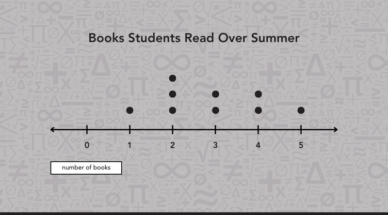
A dot plot is a graph where each data value is represented as a dot placed above a number line. The more times a value appears in the data, the more dots stack up above it. That stacking is what makes patterns in the data visible at a glance.
If you've worked with tally charts before, dot plots will feel familiar. The idea is the same: we keep count of how often each value appears, but instead of tally marks in a table, we place dots on a number line.
You may see dot plots called line plots in some textbooks or classrooms. They are the same thing. The name "line plot" tends to show up in earlier grades, while "dot plot" becomes more common in middle school. Either way, the concept and the method are identical.
📕 You May Also Like: What Is a Bar Model in Math? A Complete Overview
Parts of a Dot Plot
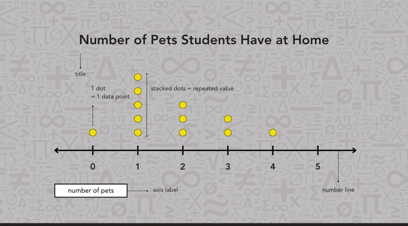
Every dot plot has the same five components. Here is what each one does:
-
Title: sits at the top of the plot; tells us what the data is about. Without it, we wouldn't know what we're looking at.
-
Number line: runs horizontally across the bottom of the plot; shows the range of possible values with equal spacing between each one.
-
Axis label: sits directly beneath the number line; tells us what the numbers represent, for example, "Number of Books" or "Quiz Scores."
-
Dots: placed above the number line; each dot represents one data point. If a student reads 3 books, one dot appears above the number 3.
-
Stacked dots: when the same value appears more than once, dots stack up vertically above that value; the taller the stack, the more often that value appeared in the data.
What Can a Dot Plot Tell Us?
More than just a picture of data, a dot plot gives us useful information about the whole data set. If we read one carefully, we can find:
-
Mode: The value that appears most often in the data. On a dot plot, it's easy to spot: it's the value with the tallest stack of dots. If the biggest stack sits above 7 on our quiz scores dot plot, then 7 is the mode.
-
Range: A measure of how spread out the data is. We find it by subtracting the smallest value from the largest. If scores run from 5 to 10, the range is 10 − 5 = 5.
-
Clusters: A group of values that appear close together and more frequently than others. On a dot plot, clusters show up as sections of the number line where dots are densely packed; they tell us where most of the data falls.
-
Gaps: A space on the number line where no dots appear. Gaps tell us there are values in the range that no one recorded.
-
Outliers: A value that sits far away from the rest of the data. On a dot plot, it shows up as a lone dot separated from the main cluster. Outliers are useful to notice because they can affect how we interpret the data.
📕 You May Also Like: What Are Mean, Mode, Median & Range in Math?
How to Read a Dot Plot
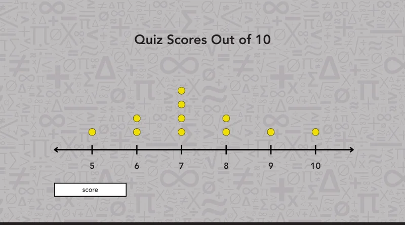
We read a dot plot in five steps. Let's walk through each one using the quiz scores dot plot below.
Step 1: Read the title and axis label first
The title tells us we're looking at quiz scores, and the axis label tells us the numbers represent scores out of 10. This gives us the context we need before we look at anything else.
Step 2: Find the scale
The number line runs from 5 to 10. That means the lowest score recorded was 5 and the highest was 10. The range is 10 − 5 = 5.
Step 3: Count the dots above each value
Each dot represents one student. Two dots above 6 means two students scored 6. Four dots above 7 means four students scored 7.
Step 4: Find the value with the most dots
The tallest stack sits above 7; that's the mode, the value that appears most often in the data.
Step 5: Look at the overall shape
Most scores cluster between 6 and 8, with the data tapering off toward both ends of the number line.
📕 You May Also Like: What Is a Frequency Table in Math? A Kid-Friendly Guide
How to Create a Dot Plot: Step by Step
Let's create a dot plot using a simple data set. Say a student tracked their daily steps, in thousands, over two weeks:
2, 4, 6, 3, 4, 5, 3, 4, 7, 5, 4, 6, 3, 5
Step 1: Find the range
Before drawing anything, we identify the smallest and largest values in the data set. Here, the smallest is 2 and the largest is 7. These two values tell us where our number line needs to start and end.
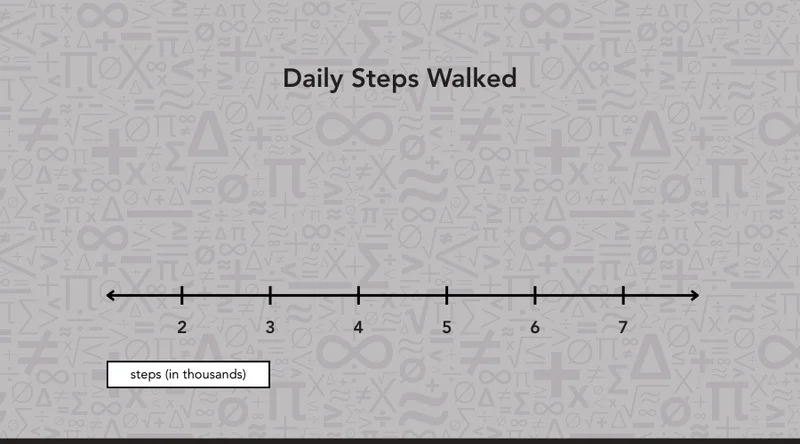
Step 2: Draw, label, and title
We draw a horizontal line and mark equal intervals across it, one tick mark for each value from 2 to 7. Equal spacing is very important, as every value needs the same amount of room.
Under each tick mark, we write the corresponding value and add an axis label beneath: "Steps (in thousands)." We also add a title at the top, "Daily Steps Walked," so the reader knows immediately what the data is about.
Step 3: Plot the data and stack repeated values
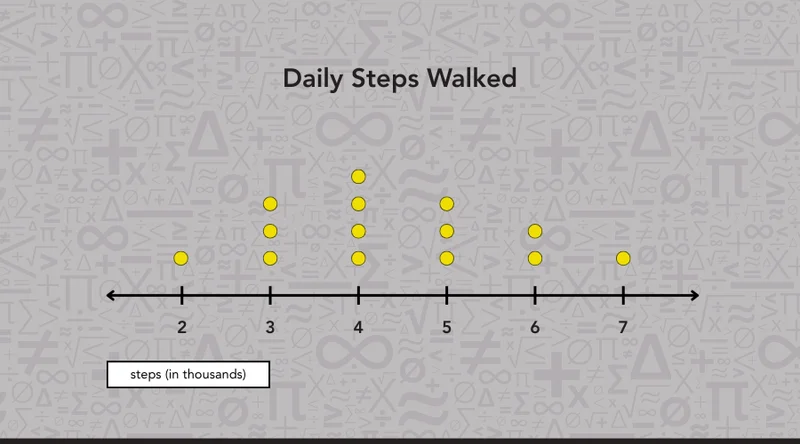
We go through the data set one value at a time and place a dot above the matching number. When a value appears more than once, the dots stack vertically:
-
2 appears once 1 dot above 2
-
3 appears three times 3 dots stacked above 3
-
4 appears four times 4 dots stacked above 4
-
5 appears three times 3 dots stacked above 5
-
6 appears twice 2 dots above 6
-
7 appears once 1 dot above 7
Fourteen values in the data set, fourteen dots on the plot.
📕 You May Also Like: How to Use a Number Line With Positive & Negative Numbers
Try It Yourself: Dot Plot Exercises
Time to put what we've learned to the test. Work through both tasks below and check your answers at the bottom of the guide.
Task 1: Build a Dot Plot
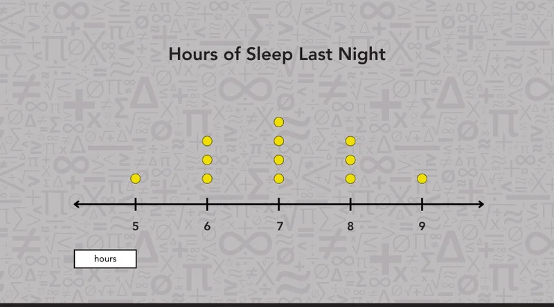
A group of students recorded how many hours they slept last night. Here are their results:
7, 5, 8, 6, 7, 9, 6, 7, 8, 6, 8, 7
Can you build a dot plot for this data set?
Task 2: Read a Dot Plot
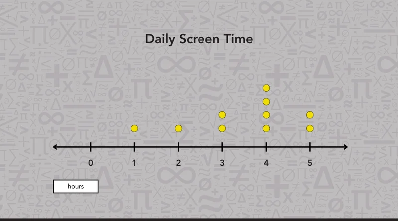
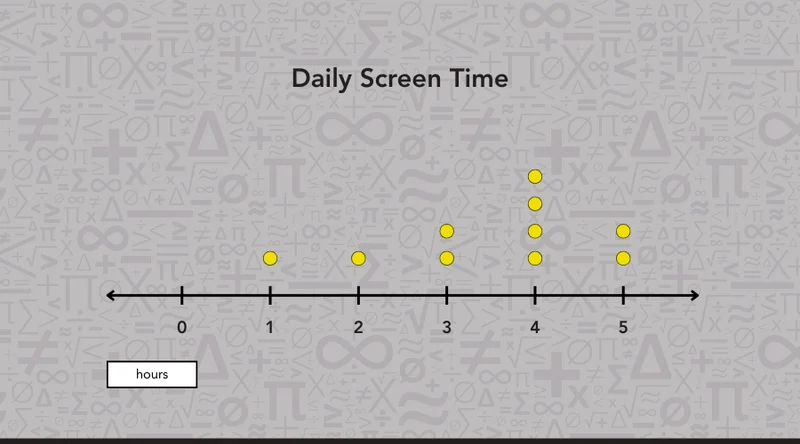
Use the dot plot above to answer these questions:
-
What is the title of the dot plot?
-
What is the range of the data?
-
What is the mode?
-
Are there any gaps or clusters in the data?
Frequently Asked Questions About Dot Plots
Dot plots tend to spark a few questions along the way. Here are the ones we hear most often at our centers, with clear answers to put any lingering confusion to rest.
1. When should I use a dot plot instead of a bar graph?
A dot plot works best when we want to show individual data points rather than grouped totals.
If we have a small data set and want to see every single value, a dot plot is the better choice. A bar graph is more useful when we're comparing larger categories or totals.
2. Where do we use dot plots in real life?
Dot plots show up in science experiments, surveys, sports statistics, and classroom data collection. Any time we gather a set of numerical values and want to see how they're distributed, a dot plot is a practical and easy-to-read tool.
3. Can a dot plot have more than one mode?
Yes. When two or more values have the same number of dots, and both appear more frequently than the rest, the data set has more than one mode. We call this bimodal (two modes) or multimodal (more than two).
4. How many data points do we need to make a dot plot?
There is no strict minimum, but dot plots work best with small to medium-sized data sets, typically between 5 and 30 values.
With very large data sets, the dots become difficult to count, and a histogram or box plot may be a clearer choice.

Mathnasium uses personalized learning plans and interactive teaching techniques to help students build a deep understanding of any math concept, including dot plot.
How We Help Students Master Any Math Concept at Mathnasium
Mathnasium is a math-only learning center empowering K–12 students of all skill levels to learn and master math.
Data and statistics, including concepts like dot plots, are topics that span multiple grade levels, build on each other, and connect directly to the analytical thinking students need for more advanced math down the road.
When students need support with these concepts or math in general, we build a personalized path forward that helps each one work through their challenges at their own pace, strengthen their foundation, and develop the confidence that carries them through every math concept that follows.
Behind each program at Mathnasium is a proprietary teaching approach called the Mathnasium Method™.
The approach starts with a diagnostic assessment, which helps us identify what a student already knows and where they need support. Using these insights, we create a learning plan customized to their needs.
With the plan in place, our specially trained tutors follow it closely, providing face-to-face instruction in a supportive and fun environment. During sessions, we use a thoughtful balance of Socratic questioning and direct teaching, along with visual, verbal, mental, tactile, and written techniques, so students can see the math from different angles and truly make sense of what they're learning.
When students feel stuck, we break concepts into manageable steps and explain both the how and the why behind each solution, building the problem-solving skills and critical thinking they can use in math and beyond.
Fun plays a big part in our approach, too. Our activities are often game-based and hands-on, and we celebrate every step of progress students make, so confidence grows right alongside skill.
The results speak for themselves:
-
94% of parents report an improvement in their child's math skills and understanding
-
93% of parents report an improved attitude toward math after attending Mathnasium
-
90% of students saw an improvement in their school grades
Whether your student is looking to catch up, keep up, or get ahead in math, your local Mathnasium center can help. Start by booking a diagnostic assessment, and together we'll create a personalized plan for math mastery.

Pssst! Check Your Answers Here
If you've given our tasks a go, check your results below.
Task 1: Build a Dot Plot
Here is what the completed dot plot should look like:
Task 2: Read a Dot Plot
-
The title is Daily Screen Time.
-
The range is 5 − 1 = 4 hours.
-
The mode is 4 hours; it has the tallest stack of dots.
-
The data clusters between 3 and 5 hours, with no gaps across the number line.