If we wanted to find out how the amount of study time impacts grades, we could take logs of the hours spent studying and doing homework and cross-reference them with quiz and test scores to see if there is any correlation between the two. But a list of numbers can only show so much on its own.
A scatter plot solves that problem. Instead of scanning through rows of data, we can plot each pair of values as a single point and let a pattern emerge visually.
Let’s look at what a scatter plot is, how to read one, and what positive, negative, and no correlation each mean. We'll also look at where scatter plots show up well beyond the math classroom.

What Is a Scatter Plot?
A scatter plot is a graph made up of individual points, where each point represents one pair of related values.
Every scatter plot has two axes:
-
a horizontal one, we call x-axis
-
a vertical one, we call y-axis
Each one measures something different.
When comparing study time and quiz scores, hours studied could be placed on the x-axis and quiz scores on the y-axis.
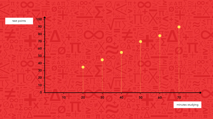
Say a student studied for 30 minutes and scored an 80 on their quiz. That pairing becomes a single point on the graph: we find 30 minutes along the bottom, then move up to 80, and mark that spot. We’ll do this for every student in the class, and a cluster of points starts to take shape.
Scatter plots use individual points instead of bars or a connected line because each point stands on its own. It represents one student, one day, or one event, not a running total or a change over time. Once we plot enough points, the pattern between the two values starts to become visible.
📕 You May Also Like: How to Read 4 Most Common Graphs - A Kid-Friendly Guide
How Do We Read a Scatter Plot?
Reading a scatter plot starts with checking what each axis measures, then stepping back to see how the points fall as a group.
We start with the axes. Knowing what the x-axis and y-axis represent tells us what two things are being compared before we even look at the data itself.
Next, we’ll look at a single point. Trace it down to the x-axis and across to the y-axis to see exactly what pair of values it represents. Then step back and look at the whole cluster instead of any one point. At this stage, we ask ourselves:
-
Are the points trending upward as they move left to right?
-
Are they trending downward instead?
-
Are they scattered with no clear direction at all?
-
Is there a point that sits far away from the rest?
📕 You May Also Like: What Is a Coordinate Grid and How Do We Use It?
What Can a Scatter Plot Tell Us?
A scatter plot can reveal one of three patterns: positive correlation, negative correlation, or no correlation at all.
1. Positive Correlation
In a positive correlation, one value tends to rise as the other one does. For example, a student who studies longer tends to score higher on a quiz.
On a scatter plot, this pattern shows up as points that drift upward from left to right, where as one variable increases, the other tends to increase as well. The trend line highlights the overall pattern, even though not every point falls exactly on the line.
2. Negative Correlation
In a negative correlation, one value tends to fall as the other rises.
For example, increasing speed usually reduces travel time, while more screen time before bed is often linked to less sleep.
On a scatter plot, the points typically slope downward from left to right.
3. No Correlation
Sometimes two values simply don't move together at all. For instance, we cannot see a relationship between shoe size and favorite color, so a scatter plot tracking these two values would display points scattered randomly rather than forming a clear pattern.
What can we conclude in this case?
We can conclude that there is no apparent link between a person’s shoe size and favorite color.
📕 You May Also Like: What Is a Box Plot in Math and How Do You Read One?
What Mistakes Do Students Make When Reading Scatter Plots?
Scatter plots can reveal useful patterns, but interpreting them correctly takes practice. Several common mistakes can make the relationship between two variables seem different from what the data really shows.
1. Treating One Point as the Whole Pattern
One unusual data point does not cancel out a larger trend. An unexpected result may simply be an outlier rather than evidence that no relationship exists. Looking at the overall pattern of data provides a clearer picture.
2. Confusing Correlation with Cause and Effect
Two values moving together doesn't automatically mean one causes the other. Ice cream sales and swimming pool visits might both rise in summer, but neither one causes the other; both are driven by warmer weather.
3. Expecting Every Scatter Plot to Show a Pattern
Sometimes the answer is that there's no clear relationship at all, and that can be a valid interpretation. Before drawing any conclusion, a student should step back and look at the shape formed by all the points together, rather than any single point on its own.
How Is a Scatter Plot Different from a Bar Graph or Line Graph?
Bar graphs compare categories, line graphs track change over time, and scatter plots show the relationship between two numerical variables.
1. Bar Graphs
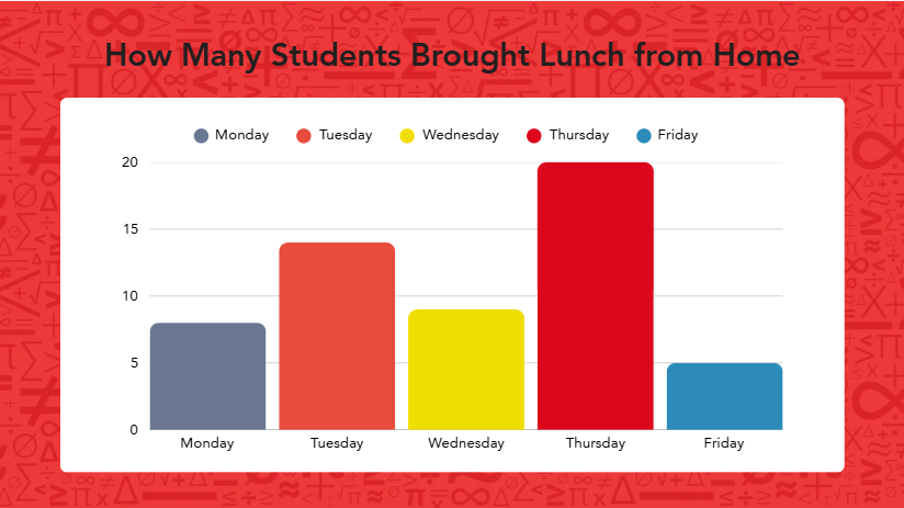
We reach for a bar graph to compare separate, unrelated categories against each other. Each bar stands on its own, so the categories don't need to have any numerical relationship to one another.
In bar graphs, we track the height of the bar to understand the trend for each category.
2. Line Graphs
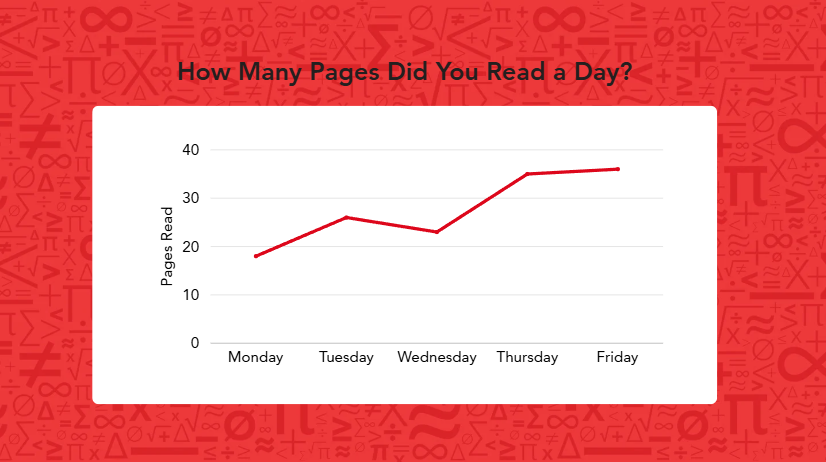
We use a line graph to track a single value as it changes over time.
We can use it to measure a change in our sibling’s height every year, a city's temperature recorded each day for a week, or a savings account balance month to month.
The connected line matters here because it shows a continuous change, and the order of the points (usually left to right, earliest to latest) carries meaning that a scatter plot doesn't need.
3. Scatter Plots
A scatter plot is the right choice when we want to see whether two different numerical values are related, so how hours studied might affect quiz scores or how temperature impacts ice cream sales.
Unlike a line graph, the points aren't connected and don't need to follow a left-to-right order. Each point simply represents one pairing of two values, and the goal is to see whether the group of points, taken together, trends in a direction.
To choose the right graph, we have to think about the question we are trying to answer; whether it's about comparing categories, tracking change over time, or examining a relationship. Building that kind of mathematical reasoning is exactly what students practice at Mathnasium.
📕 You May Also Like: What Is a Bar Model in Math? A Complete Overview
 At Mathnasium, students develop a deeper understanding of math through individualized learning plans and face-to-face instruction.
How Mathnasium Helps Students Master Any Math Concept
Mathnasium is a math-only learning center dedicated to helping K–12 students of all skill levels learn and master math.
Graphing and data analysis, including concepts like scatter plots, correlation, and interpreting patterns, are among the many skills students develop at Mathnasium. These concepts begin with reading simple graphs and grow into more advanced statistical reasoning and real-world problem-solving as students progress through school.
To help students learn and master K-12 math concepts, we employ our proprietary teaching approach, the Mathnasium Method™, designed around individual student needs and learning styles.
Each student begins their Mathnasium journey with a diagnostic assessment that gives us a clear picture of their strengths and knowledge gaps. From there, we design a personalized learning plan that targets exactly what each student needs.
Our specially trained tutors follow that plan closely, delivering face-to-face instruction in a caring and fun environment.
During sessions, we draw on a mix of verbal, visual, mental, tactile, and written techniques so students can approach concepts from multiple angles and truly make sense of what they're learning.
When students get stuck, we break the concept down into manageable steps and work through both the how and the why. In time, that approach builds the critical thinking and problem-solving skills students carry with them into every area of math and beyond.
Fun is built into how we work. Sessions are often game-based and hands-on, progress is celebrated at every step, and confidence grows right alongside skill.
The results speak for themselves:
-
94% of parents report an improvement in their child's math skills and understanding
-
93% of parents report an improved attitude toward math after attending Mathnasium
-
90% of students saw an improvement in their school grades
With over 1,100 learning centers across the US, there is likely a Mathnasium near you.
For families in and around Cerritos, Mathnasium of Cerritos is the go-to local center, with years of experience helping students of all skill levels excel in math.
📅 Schedule a Free Assessment at Mathnasium of Cerritos
Not in Cerritos?
📍 Find a Mathnasium Learning Center Near You


 (562) 653-9400
 (562) 418-8920